FRAMEWORK: HOME SCREEN OPTIMISATION
March 2023
Learners need a quick way to find relevant parts of the Framework app to focus on learning that matches their goals.
01 / Summary
Team
Design Lead
PM
CTO
2 x engineers
What I did
Design discovery
User research
Ideation
Prototyping
iOS and Android UI design
Handoff
QA
Deliverables
User flows
Clickable prototype
UI designs
02 / Framework overview & problem statement
Framework is an early startup offering a social educational app for startup employees' business skills, launched in January 2023. In Q1 2023, the home screen showed identical content to all learners. Knowing users were time-poor and needed relevant content, we saw engagement at only 6.85%, below our 30% target. While home screen content encouraged deeper app exploration, it lacked personalised relevance to boost overall engagement aligned with learners' goals.
03/ Hypothesis
We believe that by making the home screen more tailored to a learners needs, will result in higher levels of engagement across the app.
04 / Discovery
Competitor analysis
I quickly analysed competitors' home screens and found that:
They focus heavily on personalising content using user interests or known data.
New and time-sensitive event content is often highlighted.
Some encourage daily use with goals and streaks.
Suggested learning paths appear sometimes.
Personalisation is shown with phrases like "For you" or "Selected just for you."
Competitors often show much more content (up to 75 items).
Content rails are the main design used to display many items in a category.
I conducted a quick UX tear down of the existing Framework home screen. I noted:
Little of the content on this screen intentionally spoke to a learner’s preferences.
A single module showing a learning score visually dominated the top of the screen.
The screen only showed one Live event promo, even when there were multiple events
The Live event promo card didn’t indicate whether a member had already signed up for the event.
It wasn’t possible for members to act immediately and join the Live event from the home screen.
The home screen only promoted one piece of learning curriculum content (A Framework of the day).
Jobs to be done
I also considered the needs of a learner when viewing the home screen and wrote a collection of jobs to be done statements.
I want to be recommended the next thing to look at (content or social) based on my preferences.
I want to see what’s popular / what’s hot. What am I missing out on?
I want to be reminded of important events / changes coming up.
I want to choose what I see on the home screen.
Ideation
Based on the JTBD statements that I had generated I then ran an ideation session with the team. Working with the PM, we then took all of the ideas, documented them and teased out any further thoughts or questions we had.

Ideation around a JTBD statement
With a shortlist of ideas we then ran an Effort Vs Impact exercise to help us prioritise.

The final part of our discovery exercise was to reach out to members and ask them to pick their top 5 features for the home screen. I asked the Community manager to send a Typeform survey out to a group of learners.

Respondents showed a strong preference towards content discovery (Popular/ trending) and recommendations over the other features.
We prioritised features around discovery and recommendations over personalisation and learning priorities.
04/ Solution design
Content discovery
To show more relevant home screen content, we introduced personalised recommendations. The key question was which data points to use. I considered:
Show most popular based on views or completion rates
Show most popular based on social activity e.g. ‘likes’ and discussion comments
Show content based on a known user data point from the users’ profile e.g. job function, company sector, company stage
Show content based on the user’s previous views and activity
After consulting engineers and Content, we chose to show top Framework content by completion rates. Instead of automating, the Content team will manually extract data from Mixpanel and create playlists in Contentful, enabling quick testing without complex automation. The second idea was to use job function, a clean onboarding data point, which can be easily mapped to content taxonomy.

Popular Frameworks rail
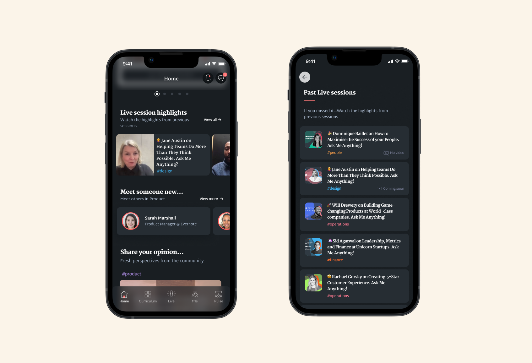
Live events
Framework’s content pillar includes weekly Live events with tech operators. They’re accessible via the app’s Live tab and were previously promoted on the home screen with a single card.
To optimize the promo card, three ideas emerged: use a carousel to showcase multiple upcoming events, enable direct event sign-up from the home tab instead of redirecting to the Live tab, and update the card after sign-up to show attendance status with a countdown or reminder.

Live event promo card carousel and confirmation sheet
Highlights video
A requested feature was adding event recordings. Placing them below Live promo cards on the home tab can boost engagement, showcase speakers, and drive conversions. The proposal includes a content rail with past event video trailers and a link to an overflow page listing all past events.
Active Learning Score Module
The final proposal for the Home tab was to rethink the welcome message and the Active Learning Score module.
The learning score module occupied most of the Home tab's top but showed little beyond the progress score. I tested ideas: one compressed the module while retaining info; the other made a static screen part dynamic, showing it only under conditions like inactivity or user milestones.

05/ Delivery
After the solution design phase, I held a Design Crit session to present ideas and get team feedback. We agreed to start with a low-effort ‘Most popular’ playlist for easy Content team implementation. Most debate focused on how much to rework the Active Learning Score module. The idea of using ephemeral bottom-sheet messaging on app launch divided opinions. We liked moving away from static messages but need to explore implementation and triggers. Instead, we chose a compact version of the current module to raise new recommendation rails higher on the screen.
After agreeing the prioritisation with the PM, I completed the detailed designs and specifications. We also discussed success metrics and event tracking to enable us to monitor the performance of these changes.
Primary metric: Click through rate (Home screen > content)
Secondary metric: Pillar DAU/MAU
We then wrote up our epics and stories and planned the coming sprint work. The home screen improvements were built, QA’d and shipped in the subsequent 2 weeks.

06/ Outcome
Three months after shipping changes we saw a steady increase in click through rates from the homepage up to +27%.